July 26, 2018

Many designers consider B2B the domain of the dull; a place where creativity goes to die and where PowerPoint is king. This is simply not true.
Just like consumer brands, B2B spans everything from boring to beautiful, and it’s incumbent on us as designers and creatives to push for the latter by providing businesses with fresh eyes and new perspectives.
After all, businesses are run by people, not just faceless suits or 19-year-old tech wizards. And these people want to work with companies that combine great services with a brand identity they can relate to.
It’s true that tech businesses are often more nuanced than selling fizzy drinks or a pair of shoes. Getting key decision makers from initial engagement to learning about your service and taking the time to book a demo is hard. But it’s this complexity that makes consistent branding all the more important across every channel.
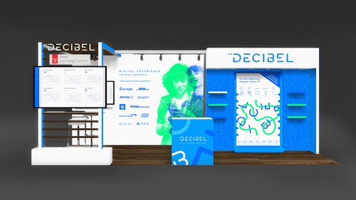
Enter our client, Decibel - a fast-moving marketing technology platform whose brand was struggling to keep pace with the business’ ambitious growth. Working alongside their marketing team, we helped them take a holistic view of the brand – producing an entirely new visual identity and set of brand applications from tone of voice to colour palette.
The challenge was to be bold in our representation of Decibel’s ambition, while also adhering to three core principles:
- Simplification
- Distinctiveness
- Usefulness
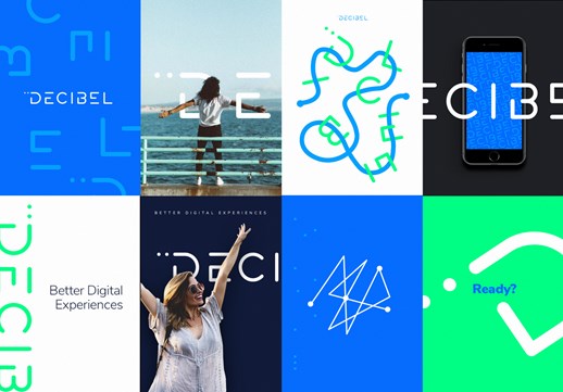
Previously known as ‘Decibel Insight’, the reduction to single wordmark ‘Decibel’ gave us the platform to create a more versatile, confident logo that was unconstrained by copy length. While ‘Insight’ went some way toward contextualising Decibel’s proposition, it failed to communicate the breadth of the business’ capabilities.
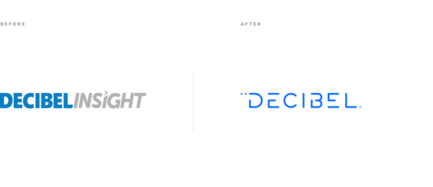
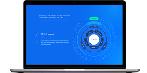
Decibel processes hundreds of behavioural metrics behind how people interact with websites – from mouse movements and device rotations, to pop-ups and errors – capturing an accurate picture of users’ on-page experience. Our aim was to create a logo that reflects this dynamic behaviour. This was achieved by producing a series of paths that combined to form the Decibel logo, while also working independently as unique assets that could be utilised within other distinctive brand expressions.
Decibel’s product is complex, so it was important for both on- and offline content to provide a jargon-free route to understanding that converts leads into demos. To achieve this, we removed any assumed knowledge in favour of relevant and timely materials that invite readers to explore further without being bombarded with information overload.
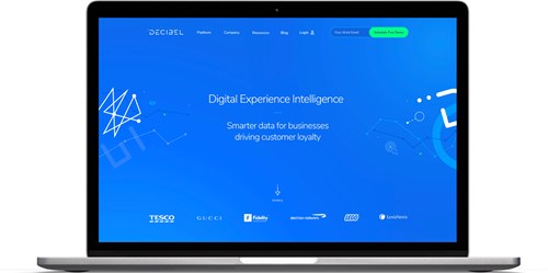
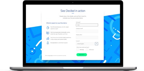
This was particularly important online, where we streamlined journeys through the website to remove unnecessary clicks and barriers to information, combining considered UX logic to our refreshed brand palette to drive interactions through the use of colour and clear visual hierarchy, including:
Consolidated use of colour and increased prominence of the primary call to action
Simplified and improved access to online booking form
Increased opportunities for engagement through interactive infographics
Simplified and improved access to online booking form
Increased opportunities for engagement through interactive infographics
B2B branding is far from boring, especially online where the opportunities for amazing work are extensive as long as the design is underpinned by sound UX/UI rational that delivers against both business needs and customer expectations.
When done well, the beauty of re-imagining a B2B brand is the quantifiable difference design can make to the bottom line.
Check out the full case study on our Behance page, here: https://www.behance.net/gallery/64777945/Decibel-Rebrand