February 11, 2020

When you think about optimisation, it usually doesn’t take that long to think about it in terms of ecommerce.
You don’t have to look far to see examples of how optimisation is key to improving conversion on an ecommerce site, but optimisation isn’t just simplifying check-out.
So, what can optimisation look like for a B2B brand that isn’t selling a tangible product from their site? What does optimisation mean for businesses operating in the professional services industry or lead generation sites like enterprise SAAS products?
Take a look at some of the examples below to see how you can get started.
1. Take a wide-angle view of the full customer journey
Start at the end and work your way back. Focus on the business objective you want your users to meet or complete. Is it to fill in a form? Download a white paper report? Or even getting them offline and pick up the phone?
Depending on where they’ve arrived from, there’s often a whole lot that has to happen to make things go your way. So, whilst optimising that contact form to remove unnecessary fields might be a quick win or test you’d want to implement, you should also consider the journey they’ve come through and the funnel that have led them there.
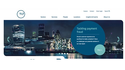
We recently worked with law firm TLT to help them optimise their existing site. We reviewed the site data and observed that the navigation was causing inconsistent journeys for users.
We conducted an audit of all the navigation links and identified the following high-level insights:
- The ‘services’ tab attracted double the amount visitors going to the ‘sectors’ tab, despite the sector tabs having twice as many pages.
- Sections such as ‘about us’ were given prominence in the main navigation, but was receiving minimal traffic.
- The ‘about us’ tab had a considerable amount of options in the drop-down which seemed to create cognitive overload.
TLT Navigation Before:

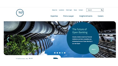
Our consultancy work saw us reengineer their navigation and site information architecture to optimise and simplify user journeys.
We reduced the number of options in the main navigation by combining the ‘sectors’ and ‘services’ under a new label called ‘expertise’. We also changed the language of ‘people’ to a more descriptive label of ‘find a lawyer’. We moved ‘about us’ and ‘locations’ to the top-level navigation, and added firm ‘news’ which was lost in the ‘insights & events’ section.
TLT Navigation After:

2. Consider the language
The language you use can make all the difference between getting someone where they need to- or completely lost. In the example above, the term ‘people’ was used in the main navigation, but also as a sub-link in the ‘about us’ section. The former directs users to a lawyer finder, whilst the other was a page that simply redirected you to the careers area. Those are two very different outcomes considering the use of the same initial label.
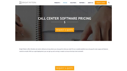
We’ve been working with a number of scale-ups recently looking to improve their digital presence. Each have their own challenges, but one thing we’ve noticed across a number of SAAS product sites is the use of the word ‘pricing’ in their navigation – and then not actually providing said pricing.
Below are two different examples where it’s very easy to imagine a potential customer being rather frustrated by their experience.
In the first, the term ‘pricing’ sits in the main navigation, but the click leads you to this:

In the second example, the user is lead to believe that by inputting a number of personalised metrics they will be given a price, supported by the call-to-action of ‘get a price’. Though once you’ve done that, what is in fact requested is all of your details so you could be sent a quote.
From a business point of view, I understand the need for data capture- and ultimately starting a conversation with a potential customer with a better understanding of their needs. But from a customer point of view, these are two examples that can be seen as rather ‘sneaky’…all depends on what side of the coin you sit.
These are just two of many examples B2B businesses can start using principles of optimisation to improve their customer/member/client experience. And here, at Tangent, it’s something we preach and deliver through both qualitative and quantitative research with a number of our B2B clients, from law firms to scale-ups.
If there’s anything you’ve read here that resonates with you and your business, get in touch and we’ll see where our chat could lead!
About this blog
This blog was orginally posted on the Digital Agency Network.


